Earlier work: payment security at Netcetera
The last thing I worked on at Netcetera was the Payment Security division: the products that banks and merchants use to secure online card payments. The products have been redesigned since, and these screens use demo customers.
The division had products on both sides of a card payment: for issuing banks, like the Access Control Server and its challenge screens, for acquirers and merchants, like the 3DS Server and an SDK for native apps, and an incubator for new products, like Click to Pay. I worked across all three, starting as the division’s only designer, and over a couple of years I brought in three more designers.
Challenge screens
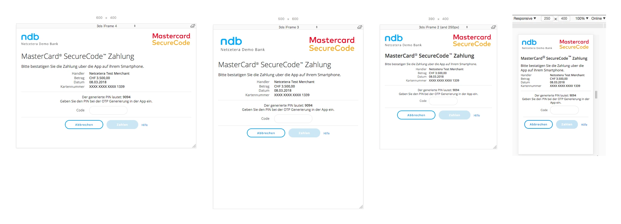
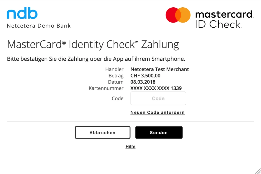
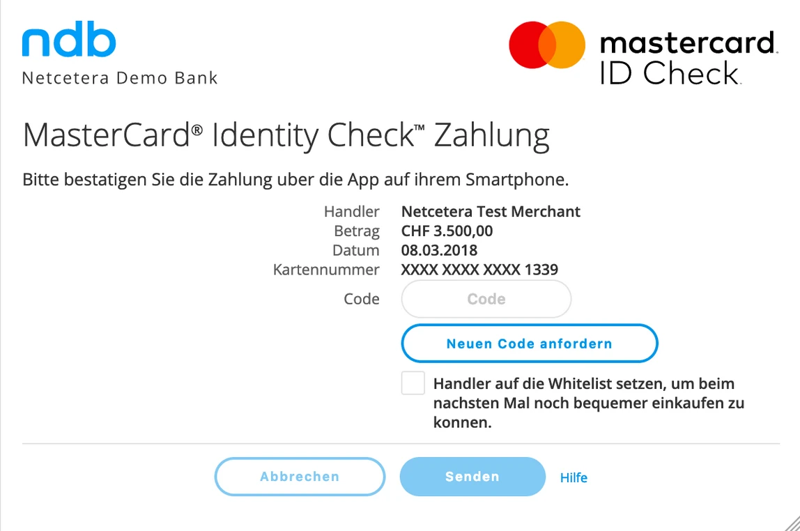
The screens a cardholder sees when their bank asks them to confirm an online payment (3-D Secure). The UX hadn’t changed much since the first version of the product, but every bank needed its own branding, so I worked on restructuring the frontend to make branding customizations as easy as possible.
The constraint. When we started, we had to keep the old layout and only refresh the styling, because customers were reluctant to change the screens: a new layout would break their custom styling overrides. But the screens had too much text and weren’t responsive at all, so we proposed the changes you see below.
I also evaluated and improved the accessibility, adapted the screens for web, mobile and mobile webviews, and for other languages and cultures, including Arabic, and analyzed the payment flows and drop-outs together with the Product Owners.
Outcome. The Customer Onboarding and Customer Maintenance teams spent less time on each bank, the protocol was updated to improve the flows and reduce drop-outs, and better accessibility and internationalization attracted customers who cared about them.
In native apps. The team also built an SDK, so merchants could show the challenge screens in their own apps, and we designed a demo merchant app to show how the screens could follow a merchant’s colors.
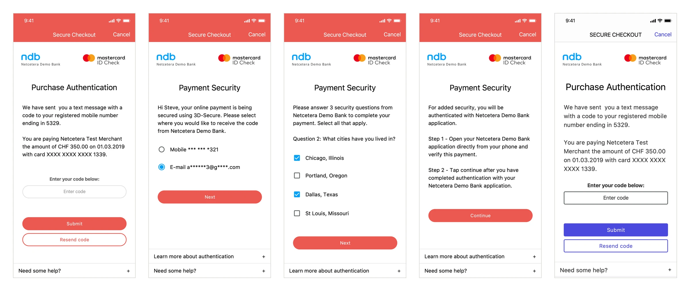
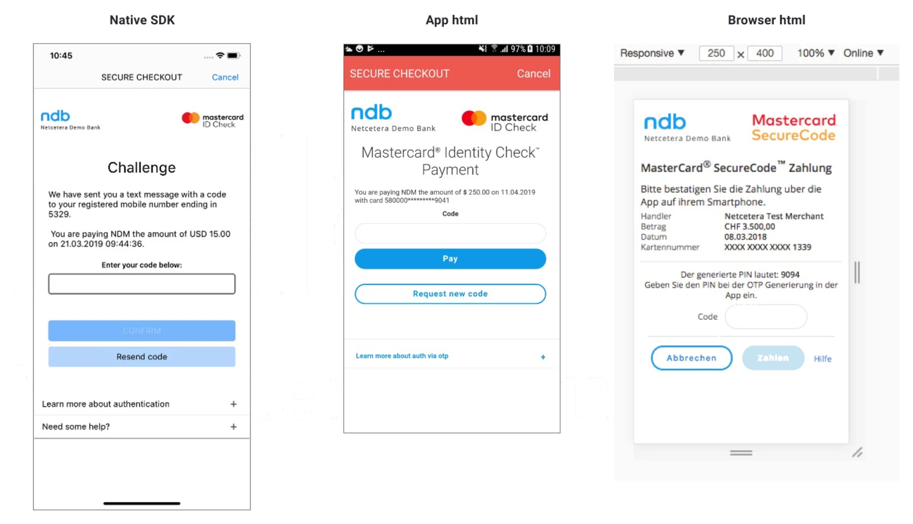
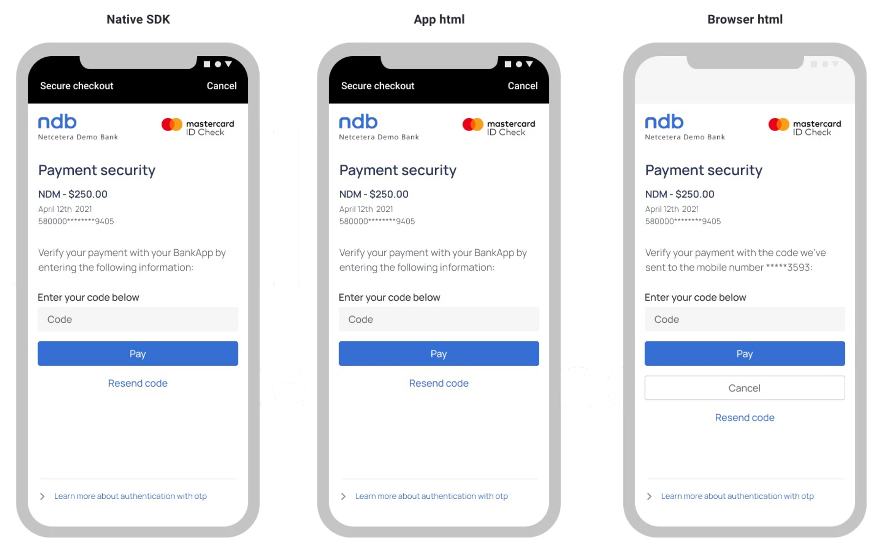
A design system for every platform. By 2021, the same challenge looked different in the native SDK, in an app’s webview and in the browser. I pitched a design system for the payment products: one design language across all platforms, as little customization by merchants as possible, because amateur-looking pages raise security concerns, especially for lesser-known brands, and fewer design quirks and inconsistencies. I left before it was implemented.
Current state, 2021
Proposed, with a design system
An admin tool for the Access Control Server
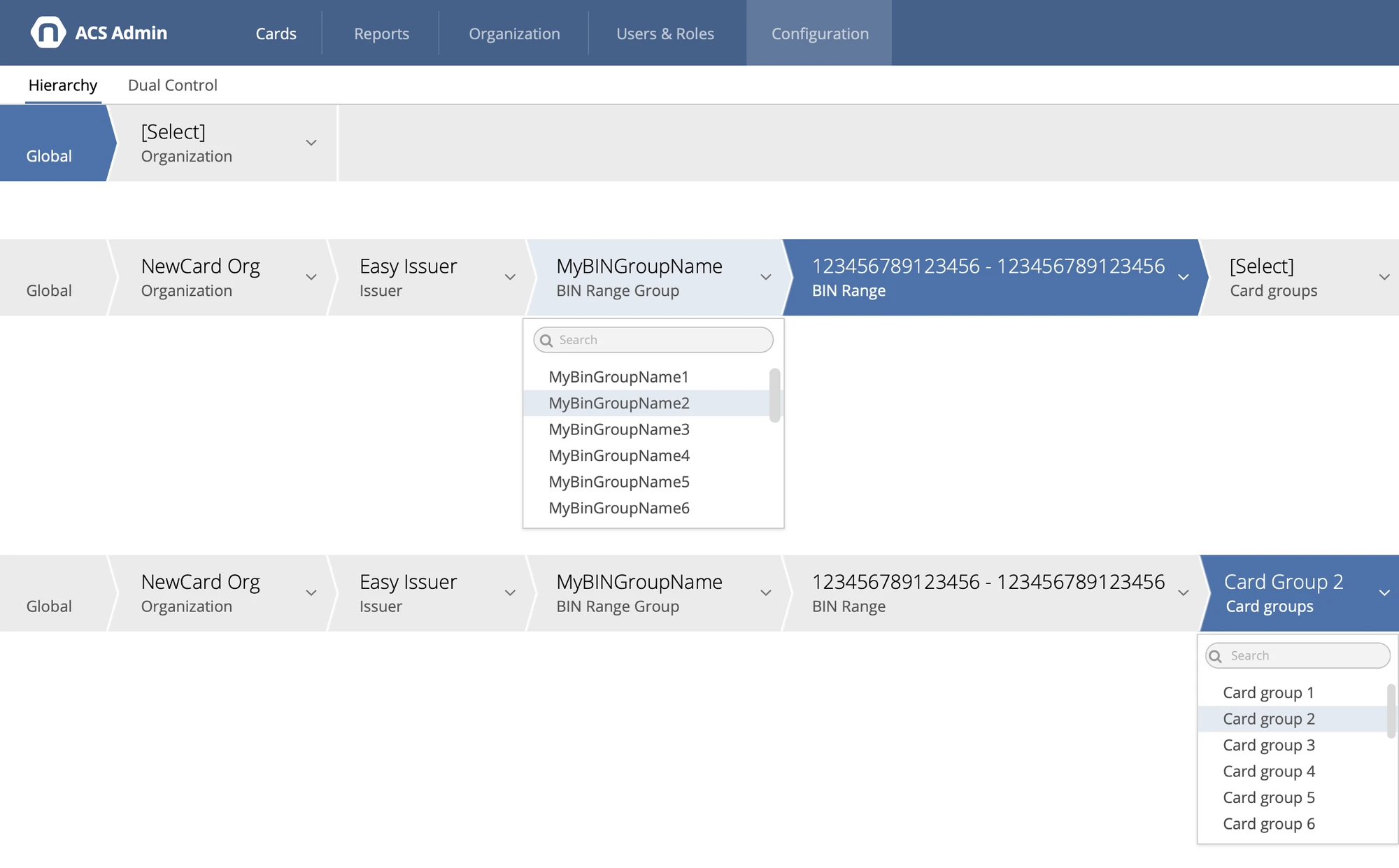
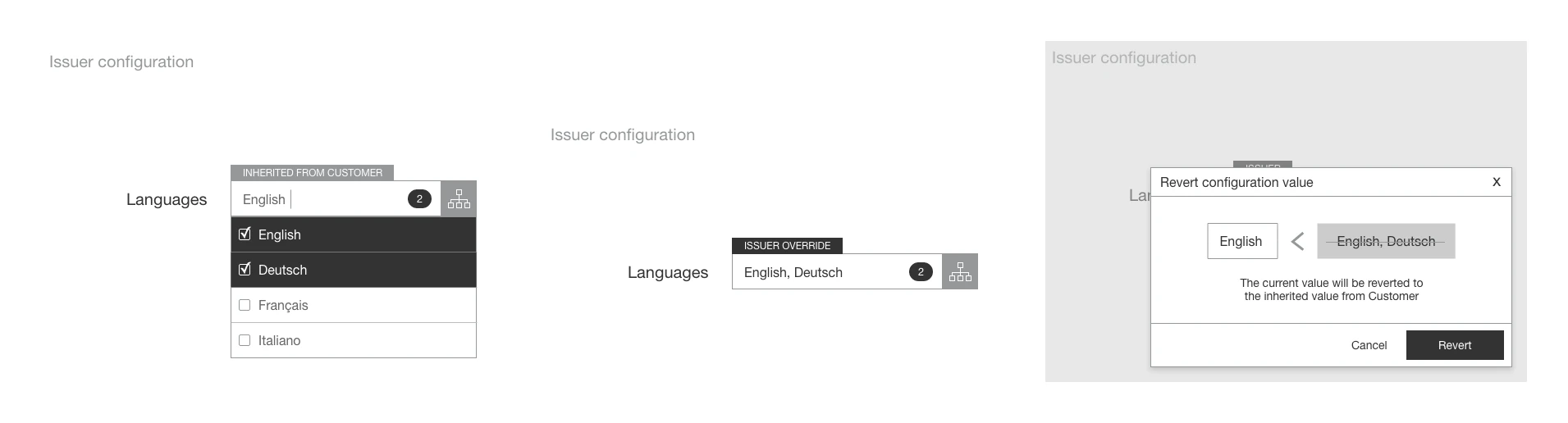
The tool that application support and developers used to configure banks and review payment issues. The biggest challenge was inheritance: a setting could be defined globally, then overridden by an organization, an issuer, a BIN range group, a BIN range and a card group, and people needed to see where each value came from.
I made the initial wireframes, ran usability testing sessions with the application support and development users, designed how inherited values, overrides and reverts appear in the UI, and built reusable frontend components, which grew into a pattern library.
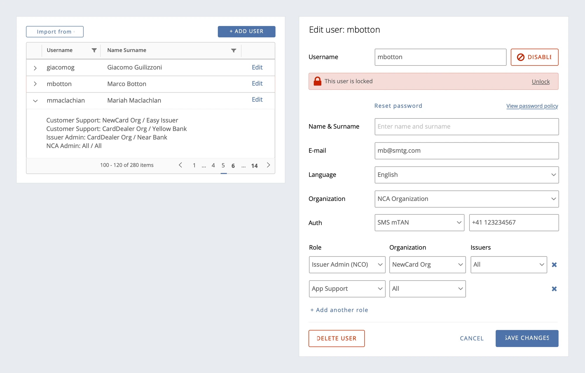
Users and roles. I also worked on the permissions model and role assignment, and on the user and organization settings. A user can have several roles, each limited to an organization and its issuers.
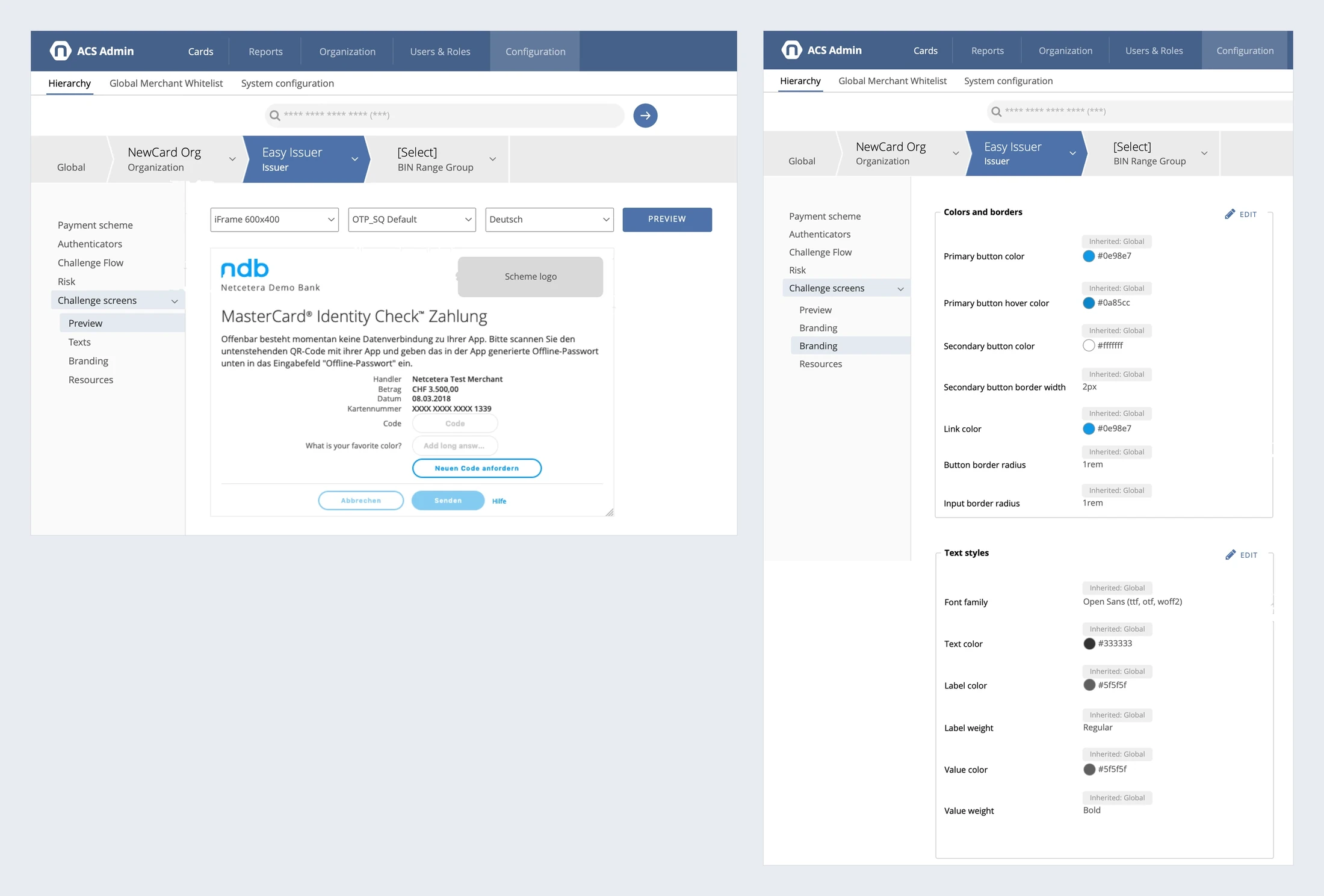
Styling by the banks themselves. We also started exploring how banks could configure the styling of their challenge screens in the admin tool, instead of overriding it in code: a preview in each window size, challenge type and language, and colors, fonts, texts and logos inherited down the same hierarchy.
Outcome. Application support specialists and developers spent less time on configurations and reviewing payment issues, first and second level support responded faster, and development was faster thanks to the reusable components.
What I’d do differently. We built the components on an external library, which made maintenance hard. When UX involvement dropped later, the configurations kept growing and didn’t scale well. And I’d add metrics from the start, to show the value of UX.
Click to Pay widget
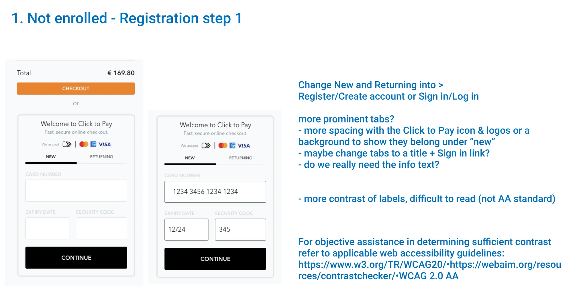
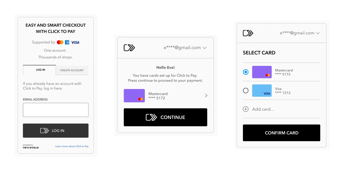
A checkout widget based on the EMVCo Secure Remote Commerce specification, which Visa, Mastercard and American Express backed as the successor of Masterpass and Visa Checkout. It had to follow Visa’s and Mastercard’s implementation guidelines, but still left some freedom for a customized UI. I evaluated the first version for usability and accessibility, ran usability tests, built the frontend in Svelte, and made sure it met accessibility standards. The product’s design has changed since.